- Home /
- Creations
- / Labels & packaging
- / Vodka KRASNAYA
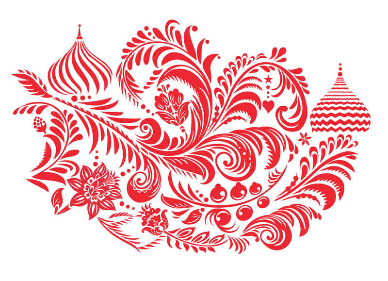
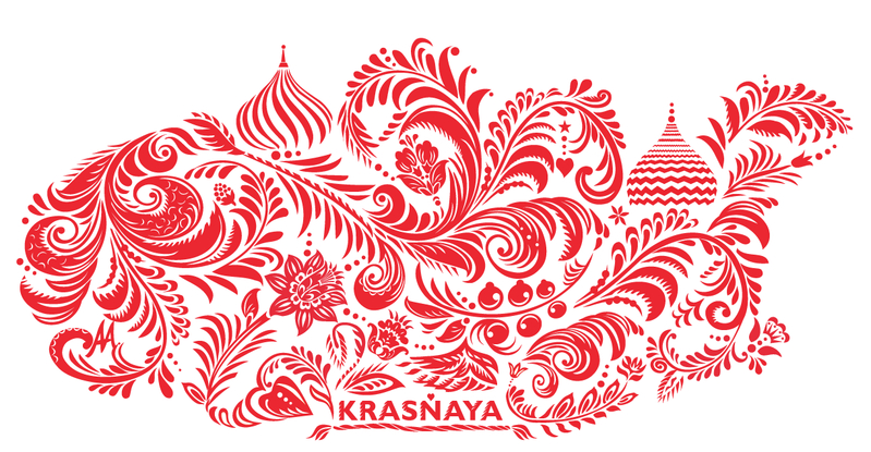
Labels & packaging: Vodka KRASNAYAProblem: Creation of a corporate identity for new vodka "KRASNAYA" Originally the customer asked for a lavish and elegant design on an inexpensive glass container. So the designer’s intention was to give an extra value to an ordinary bottle of Vodka.
Historically Vodka is the national drink of Russia. “Krasnaya” in Russian means “red”. This colour has a powerful association with the Russian culture (Red Army, Red Square) and it is directly linked to the traditions of the country.
The print on the bottle seems to be handmade with a paintbrush and gives a feeling of an art piece.
“Kokhloma” was the inspiration behind this painting technique. It appeared in the second half of the 17th century in the homonymous village where craftsmen had been known for making and selling their handmade goods, mostly tableware, known for its curved flower, berry and leaf patterns.
The sandblasted glass recreates the look of a frozen vodka bottle that can be successfully reused as a decorative piece in order to have a second life. |
Release Date: 2015-01-22 Design: Milovanova Anna |
 |
|
 |