- Home /
- Creations
- / Labels & packaging
- / Vodka VIZITA
Labels & packaging: Vodka VIZITAProblem: Creation of a corporate identity for a vodka "VIZITA". Concept: Love for sale. Visita is an italian word meaning “visit” but in Greek it actually means “a visit by a courtesan”. These ladies know all about pleasure and they are willing to give satisfaction to men.
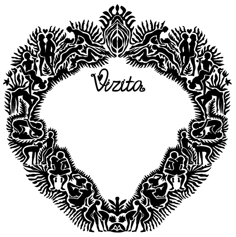
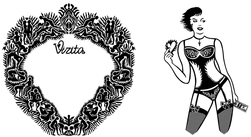
The front side of the bottle bears a heart-shaped ornamental strip with the brand name. With a second closer look one can see different scenes and poses of intercourse inspired by Kama Sutra, the ancient Indian manual on lovemaking. All together these figures create an elegant pattern with a clear reference to the female sex.
A woman is printed on the back side of the bottle. She holds a heart in her right hand and a dollar in her left hand. Her face is turned to the left while her body has a sensual pose. She’s wearing sexy underwear with flame motifs.
From each side and through the transparent liquor one can see the magnified print of the other side. This has also the symbolism of the distorted images that people could have after consuming alcohol.
The concept of the whole design links the satisfaction of having love and the pleasure of having a drink. |
Release Date: 2015-01-01 Design: Milovanova Anna |
 |
|
 |
|
 |